Neiman Marcus App

iOS App Design

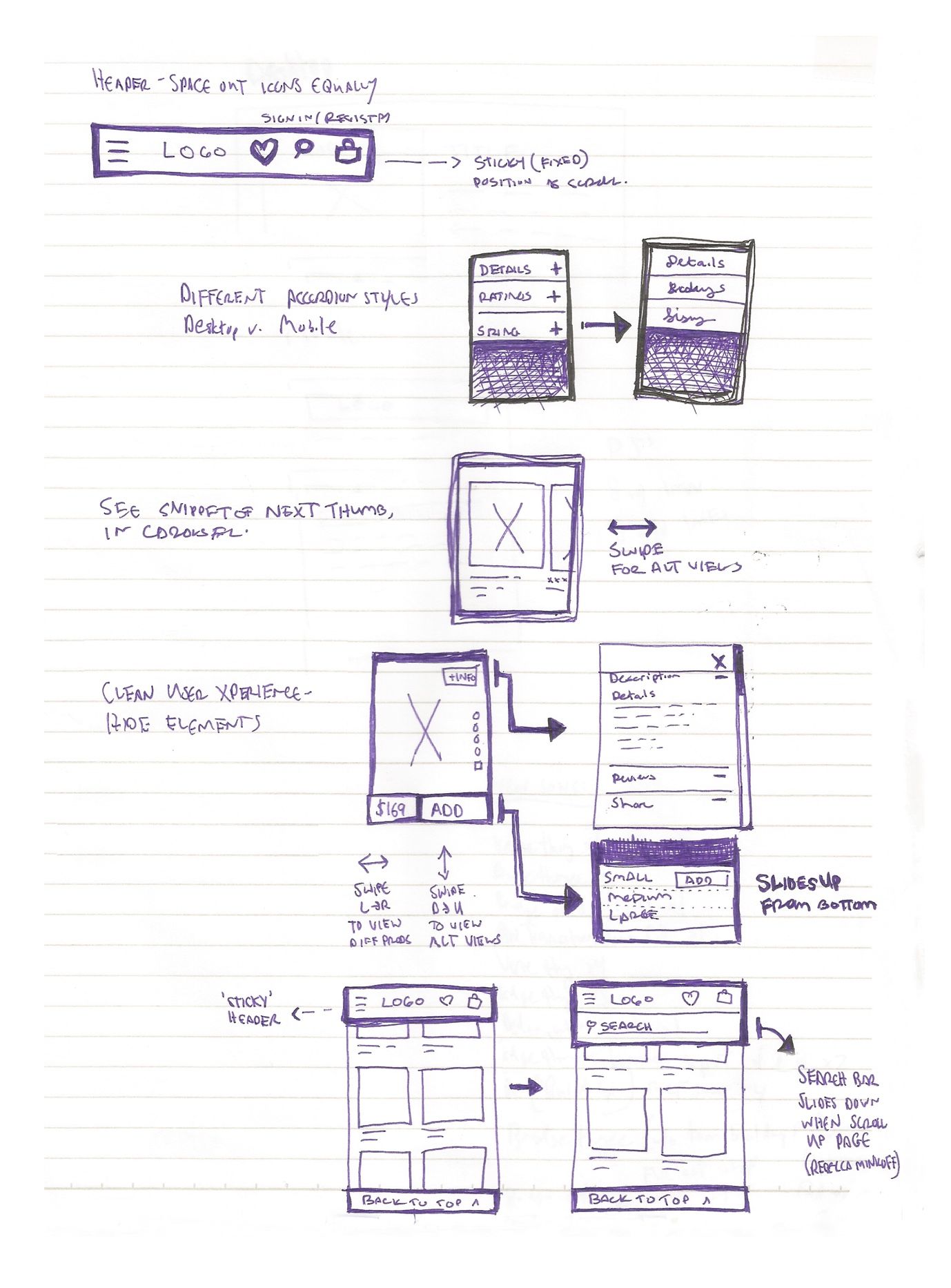
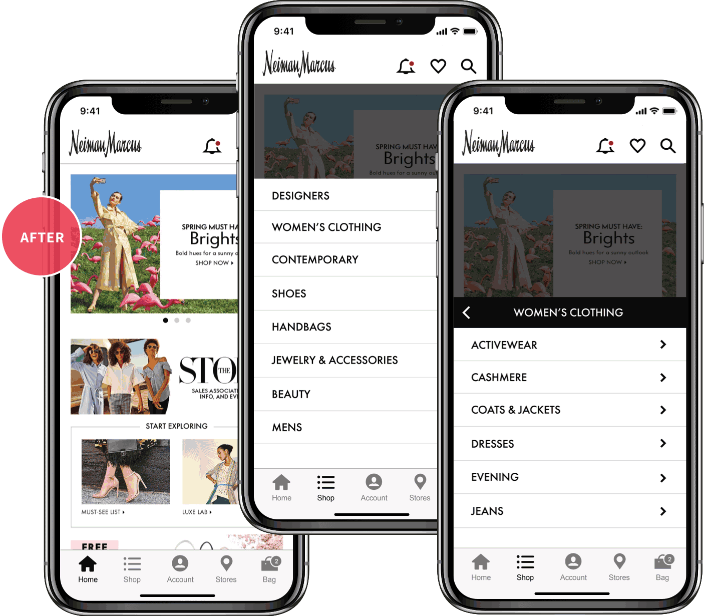
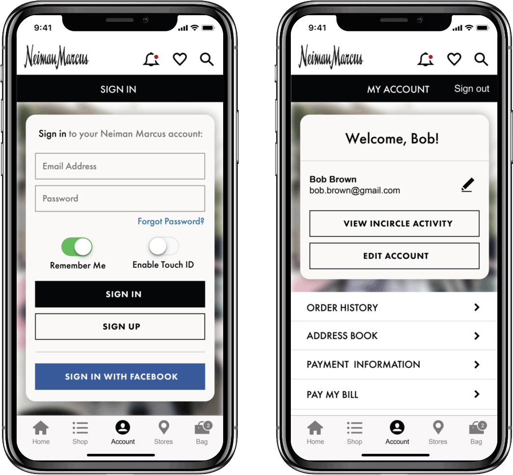
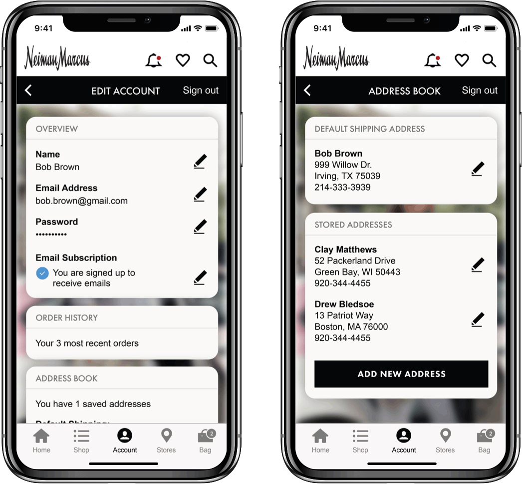
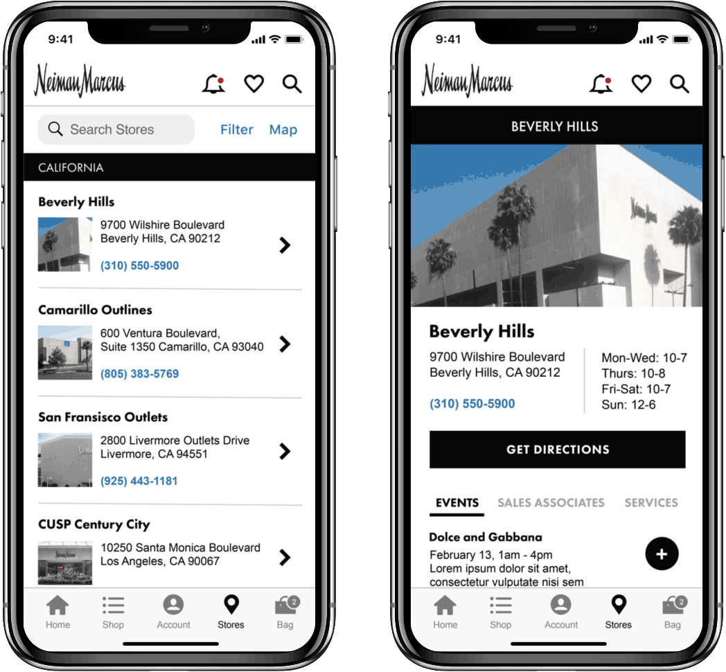
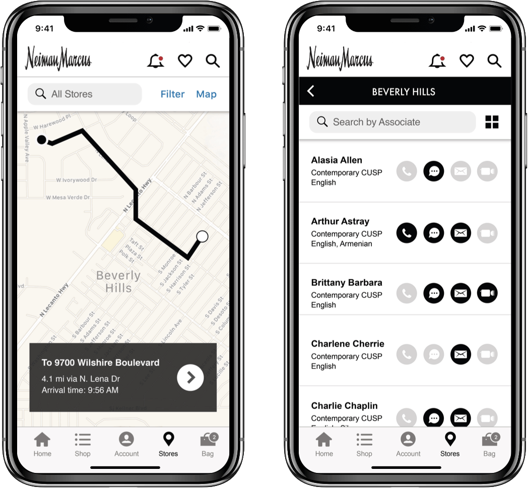
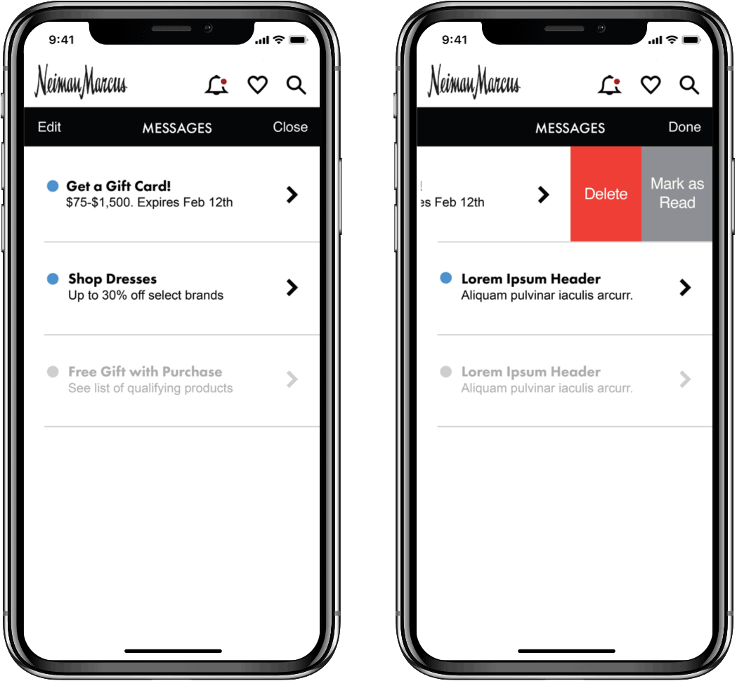
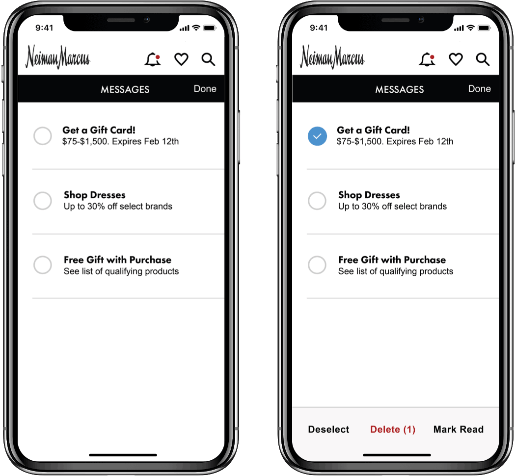
The NM iOS App was outdated — skin and bones. There was a content overload and the functionality was glitchy. The UI was using iPhone 5 standards and the app was non-ADA compliant. We wanted to introduce best practices and to re-skin the architecture to reflect that.

AGENCY

Neiman Marcus

Role

UX/UI Design Lead

Year

2018

Agency

Neiman Marcus

Role

UX/UI Design Lead

Year

2018

Initial Sketches

The goal was to simplify the navigation to make it easier to get from point A to B. Reimagined user flow and created wireframes to show new functionality, such as gestures and pinned elements.

Mobile Usage of Customers

10%
iPhone X Users
5%
iPhone 8 Users
25%
iPhone 7 Users
85%
Running Latest iOS

Global Navigation

Cleaned up navigation and introduced a new set of icons. Removed main hamburger nav and incorporated bottom tab bar for main menu navigation.

Tab Bar Navigation

With the addition of a bottom navigation bar, the main categories are now more accessible by being exposed. Nested menus have been added to the shopping categories, allowing for a cleaner, navigable experience.

Average Daily Users

13K
Returning Users
10k
New Users
90%
App traffic on shop, account and home pages

Account Section

Information within this section was disorganized. The idea was to introduce a dashboard concept to show your account in one view. Graphically, updated to a modern palette by using design components such as: background image blur, card style with rounded corners and distinct iOS style headers.

Store directory

Cleaned up this section to make it easier to locate stores and contact store associates. The UI components have been updated with a cleaner look.

Messaging

Accessible via the global nav, messaging needed a revamp. Using native iOS components, this section now achieves the simple tasks of deleting or viewing your messages.